


Responsive Website Design

Responsive Website Design Company in Delhi NCR

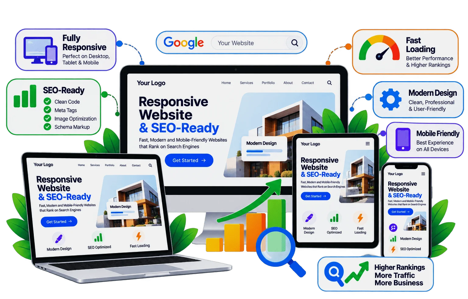
A responsive website rearranges itself to fit any screen, from a small phone to a wide desktop, so every visitor can read, tap and buy without zooming. Gowebkart designs new websites mobile-first and converts older websites into responsive ones, keeping them fast and friendly for Google.

Responsive website design by Gowebkart

What we do

Responsive Web Design Services

Whether you are starting fresh or fixing an old site, we make it work on every device.

Mobile-First

Designed for the Phone in Your Customer’s Hand

Most people now find businesses on their phones, and Google looks at the mobile version of a website when deciding rankings. So we design the phone layout first: readable text, thumb-friendly buttons, short forms and menus that open cleanly. The same design then grows to use the extra space on larger screens.
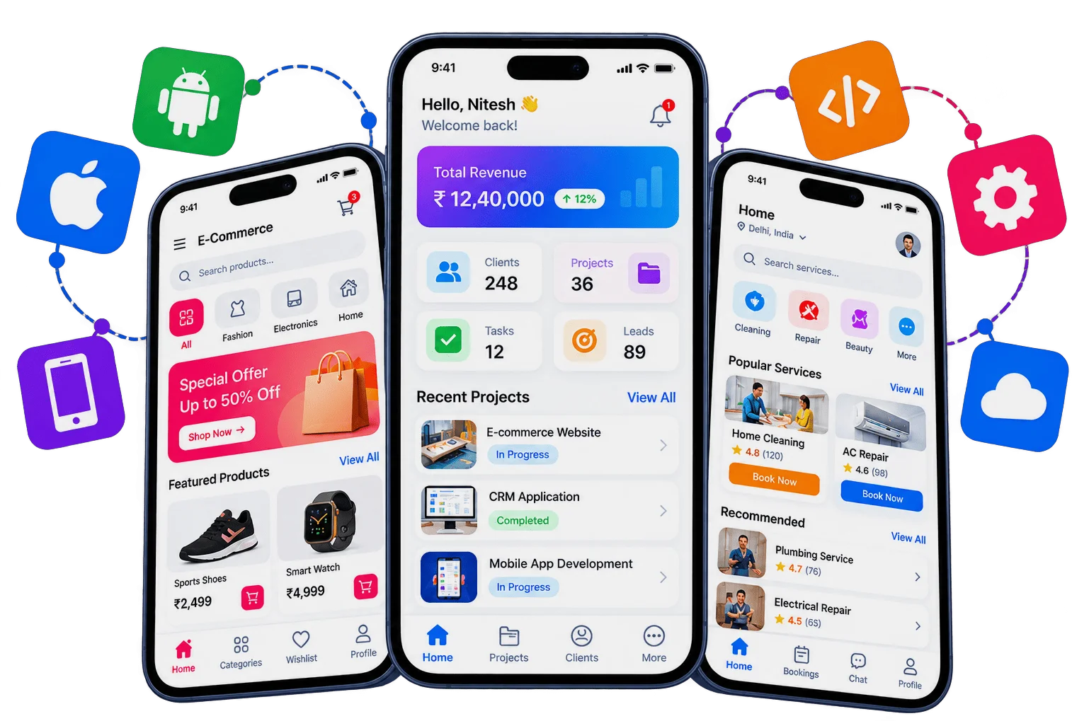

Illustration of a hand holding a phone showing a mobile-friendly website

Old Website?

Turn Your Old Website Into a Mobile-Friendly One

If your current website shows tiny text or needs pinching and zooming on a phone, it is losing visitors. We rebuild it with a responsive layout, keep your content and page URLs, and improve speed along the way, so you get a modern, mobile-friendly website without losing your search rankings.

Learn more about Old Website?
Website redesign services by Gowebkart

How we work

Our Responsive Design Process

Every layout is planned, built and tested across real screen sizes.

  1. Plan Breakpoints

    We decide how each section should look on phones, tablets and desktops.

  2. Design Mobile First

    The phone layout is designed first, then adapted for larger screens.

  3. Build Flexible Layouts

    Fluid grids, flexible images and responsive typography in clean HTML5 and CSS.

  4. Test on Real Devices

    We check Android phones, iPhones, tablets and browsers before launch.

Why choose Gowebkart

What Makes Our Websites Truly Responsive

  • Fluid Layouts

    Sections reflow neatly at every width.

  • Readable Text

    Font sizes that suit each screen.

  • Tap-Friendly

    Buttons and links sized for thumbs.

  • Flexible Images

    Right-sized images for faster loading.

  • Mobile Menus

    Clean, app-like navigation on phones.

  • Large Screens Too

    Looks sharp on wide and 4K monitors.

  • Core Web Vitals

    Speed and stability checked with Google tools.

  • Browser Tested

    Works in all major browsers.

Let’s talk

Is Your Website Hard to Use on a Phone?

Share the link to your current website, and we will show you how it can work better on mobile.

We will check your current website on different phones and screens, point out the problems and suggest the best way to fix them, whether a quick update or a full redesign.

Call for a free consultation

+91 99992 79077Or Contact Us

Reviews

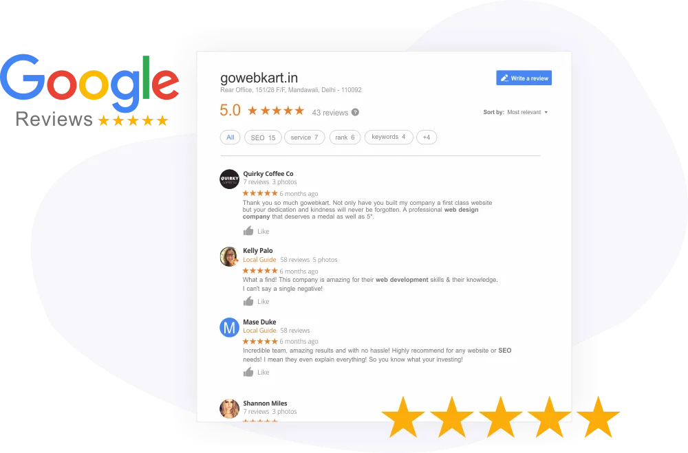
See what our customers think

The website design looks very good and professional. The overall layout, appearance, and presentation are excellent. Great work!

PSS RaoView review on Google
Review 1 of 20
Write a Review
Gowebkart customer reviews on Google

FAQ

Responsive Website FAQs

A responsive website automatically adjusts its layout, text and images to fit the screen it is viewed on, so it is easy to use on phones, tablets and desktops without a separate mobile site.

Open it on your phone. If you have to zoom or scroll sideways to read it, or buttons are hard to tap, it is not responsive. You can also narrow your browser window on a computer and see whether the layout adapts.

Yes. Google uses the mobile version of a website for indexing and ranking, so a mobile-friendly, fast site has a better chance to rank and keeps visitors on the page longer.

Yes. We convert existing websites into responsive ones, either by updating the current code or by rebuilding the layout, while keeping your content and page URLs.

They work together. Responsive design means the layout adapts to any screen; mobile-first means we design the phone layout first and then expand it for bigger screens.

Yes. We test in current versions of Chrome, Safari, Firefox and Edge on Android, iPhone and desktop.

Usually not. A responsive website serves most businesses well. An app makes sense when customers use your service often, need notifications or offline features.

Cost varies with whether you need a new website or a conversion, and with how many pages there are. Send your website link or requirements and we will quote, or dial +91 99992 79077.