





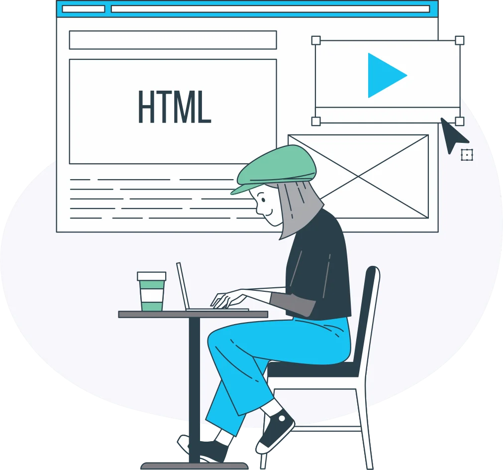
Pixel-Perfect & Responsive
Code That Matches Your Design on Every Screen
We compare every coded page with your design side by side, so colours, fonts, spacing and alignment stay true to the original. Where the design shows only a desktop view, we plan tablet and phone layouts that keep the same look and test the pages in Chrome, Safari, Firefox and Edge.
Learn more about Pixel-Perfect & Responsive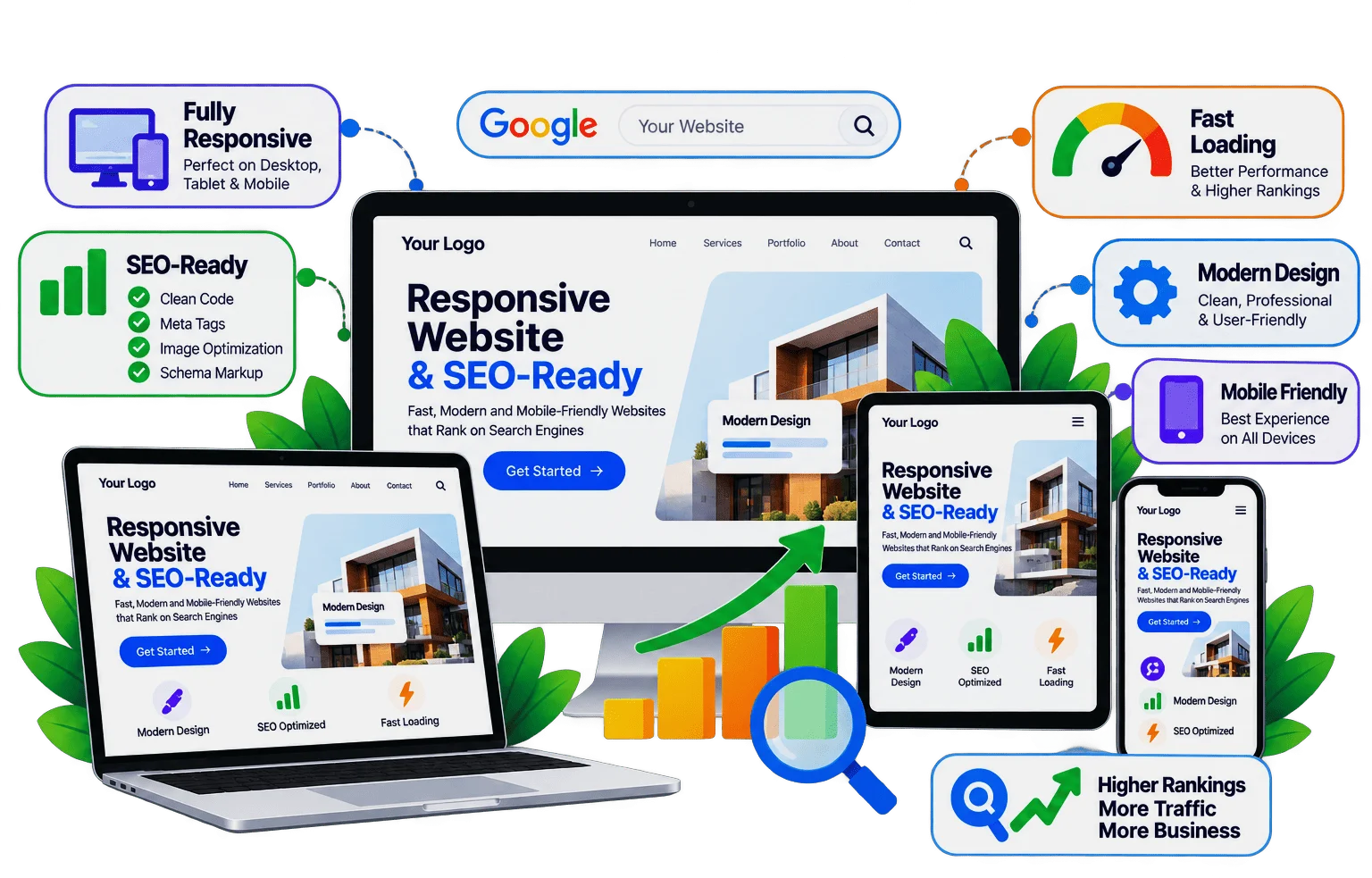
 View review